
With this tipping of the scales, Google has announced that it will give precedence in mobile search results to sites that are mobile-friendly. We’re talking billions of search queries while people are on the go, and many websites are scrambling to make their websites look great on mobile—not only for user experience, but to stay in the game when Google returns search results.
But how to proceed? Should your site be made “responsive” so it fits any size device, or should you create a separate mobile website?
We compare and contrast the two options:
Option 1: Responsive Design
Description: A responsive site will automatically adjust all elements on the page to the size window you’re using: desktop, tablet, or mobile screens large and small.
Example: www.cazarin.com (If you resize your browser window, the content shifts to accommodate it.)

Pros:
- The site works regardless of device size, because it scales and moves content dynamically to fit each screen.
- There is only one site, so you don’t have to worry about duplicate content issues. This also makes maintenance easier.
- Any changes to the site can be done once.
- This option will also adapt to whatever devices your visitors may be using in the future.
Cons:
- For current sites, this means a full-scale redesign, so it’s much more labor-intensive and takes more time. (New sites can be created as responsive sites. If your site is due for a redesign, this may be the best option.)
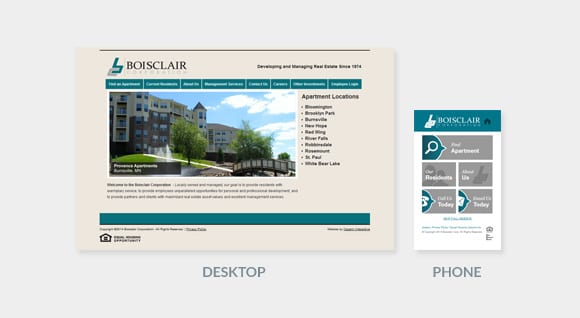
Option 2: Separate Mobile Site
Description: Build a small separate site, and redirect mobile devices to the mini-site instead of the main one.
Example: m.boisclaircorporation.com
Pros:
- This is a faster, cheaper approach. You can choose to put just a few of your most important pages up, and then link to the main site for pages that are viewed less often.
- If you want to have a significantly different experience for mobile users, it may be best to create a separate mobile site.
Cons:
- This approach requires more maintenance, since you now have two sites. Content will need to be kept consistent between two different versions.
- Site traffic, backlinks, and other SEO factors will be diluted due to this being a separate site from your main domain.
- The mobile site is generally sized to fit the smallest standard mobile screen size. This means it won’t always necessarily fit different devices perfectly.
- In the future, a separate mobile site will become more and more difficult to maintain as device sizes change.